Rework displ - Done with CSS?
2020-08-29
All started with small screen compatability,
I figured having nav bar on right and overflow is the laziest way to achieve this.
Soon I realized, No special display elements just random css margins were everywhere. Decided to rework css from scratch.
So,
---------------------------------------            ---------------------------------------
|       version 1                     |--> Body <--|        version 2                    |
|  ---------------------------------  |            |  ---------------------------------  |
|  |                       |       |  |            |  |                     |         |  |
|  |                       |       |  |            |  |                     |  nav    |  |
|  |      main             |  nav  |  |            |  |        main         |---------|  |
|  |                       |       |  |            |  |                     |         |  |
|  |                       |       |  |            |  |                     |  aside  |  |
|  |                       |       |  |            |  |                     |         |  |
|  |                       |       |  |            |  |                     |---------|  |
|-------------------------------------|            |  |                     |  footer |  |
|             footer                  |            |  |                     |         |  |
---------------------------------------            ---------------------------------------
No other way than tables?
Take 1: table
<body>
<main> .. </main>
<nav> .. </nav>
<footer> .. </footer>
</body>

body { display: table;}
main,nav,footer { display: table-cell; }
nav { vertical-align: top; }
footer { vertical-align: bottom; }
<!-- wdym by gaps?? -->
Take 2: flexbox
<body>
<nav> .. </nav>
<main> .. </main>
<footer> .. </footer>
</body>

body { display: flex; }
nav { order: 2; }
<!-- so stupid no way to place footer -->
Take 3: Grid
All you need to know for creating a webpage (2020) - Grid Templates
grid-template: "main nav"
	       "main aside"
               "main footer"
Thought I'm done, but here's the real pain.
Spleen (call me crazy, no turning back)
really hates random dimensions, no exact way to find
what's right. Tinkered all possibles ways, worth it? heck yeah!
Changes
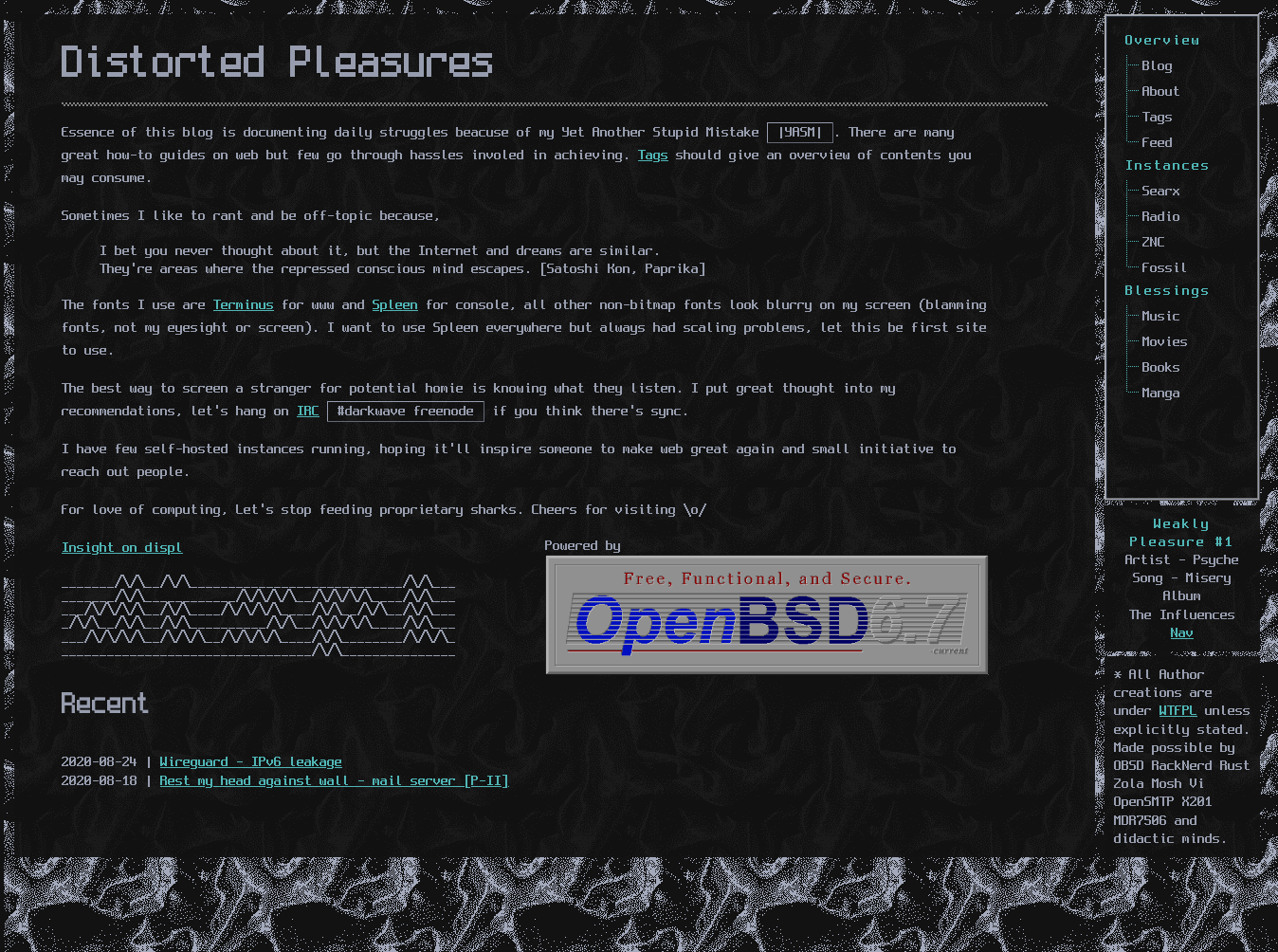
- Dark & Darker themes - Made a darker theme week ago but it only respects System preference (should a toggle necessary?).
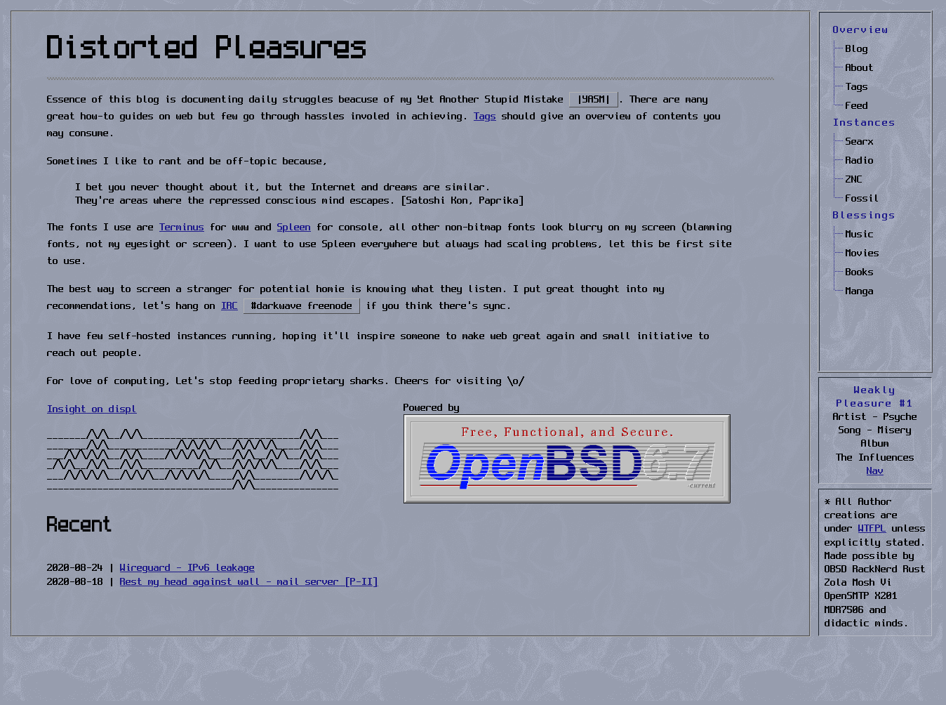
#979dae #1e1a8b (original, prefer this personally retains early web look)
#121212 #50b5b5 (Darker)
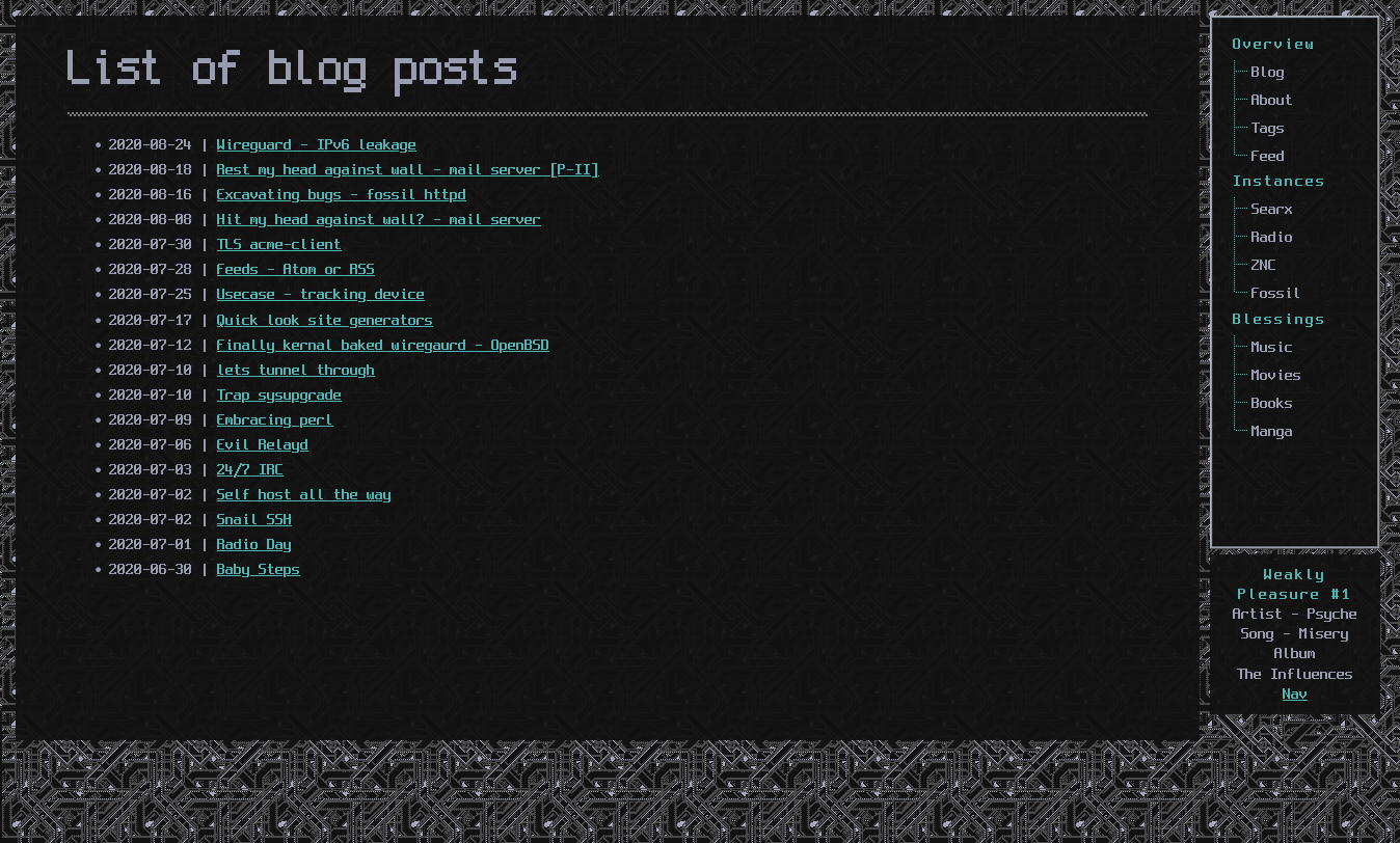
- Recently started collecting *nix patterns - tiles and Intergrated as background for displ
- Each Blog post will have different background.and those tiles are unique to themes, trust me! it looks different though has just a single transparency alpha layer (really thinking theme toggle without JS?)
- Weekly Pleasure sidebar - features music, movies, books, links etc..
- Found Spleen's sweet spot (finally)
- Tested "Responsive Device Mode" on firefox to emulate different devices (ofcourse cool trick)
- Publish www source code - waiting for zola 0.11 to land
Screens


Stranger on cyberspace, hope it renders great.
Pop a mail if it appeals, feedbacks or looks crap (0_0)
hisacro [at] this domain.